Think Patient
A mobile website helps users find a primary care physician that aligns with their health values on their first try.
Role
Researcher,
Product Designer
Tools
Figma, Miro, Optimal Workshop, Otter.ai, ChatGPT, G-suite
Timeline
April - June 2023
Skills
User research, Synthesizing Research, Sketching, Wireframing, Branding, Prototyping, User testing
People seek doctors whose medical practices resonate with their health beliefs and values.
THE PROBLEM
Finding a new primary care physician is a lengthy process of trial and error
Due to limited information about providers' medical approaches on their online profiles, users often face the challenge of making blind choices, resulting in poor provider-patient matches. This forces users into a time-consuming and frustrating trial-and-error process to find a suitable match.
THE SOLUTION
A quick assessment matches users with a primary care physician that aligns with their health values
I created Think Patient, a mobile website designed to help users find a primary care provider that aligns with their health values on their first try. A quick assessment matches users with providers whose medical approaches align. Once the user selects a match, they can book directly through Think Patient.
Research Phase
COMPETITOR ANALYSIS
Limited information on primary care providers hinders users from making a personalized selection
I conducted a competitive analysis to understand how competitors connect people to new primary care physicians. Emphasis was placed on the available features, successes, and shortcomings, revealing opportunities for innovation.
Health insurance portals do not align with Usability Heuristics:
Cluttered design with poor visual hierarchy
System-oriented terminology is difficult to understand
No information about doctors’ health values
One Medical became one of my references for a user-friendly approach to finding a primary care physician.
However, the platform had the following shortcomings:
Inaccessible — membership fees make it difficult for low-income users to access the service
No information about doctors’ health values
USER INTERVIEWS
"It's like choosing someone blindly."
Through in-depth user interviews, I gained insight into participants’ first-hand experiences searching for, selecting, and visiting primary care doctors. Our insights validated the data collected from the competitor analysis thus revealing a clear opportunity for innovation.
Key Findings
Participants experienced common frustrations
relating to their primary care experience.
"It's like choosing someone [a primary care physician] blindly."
– Camila P
INSIGHT: Participants need more information on doctor profiles to make a confident selection when looking for a new primary care physician.
“... the process of not only having to motivate myself to contact the people, but also looking for providers in my network, and scheduling the appointment, remembering to go to the appointment... all these things.”
– Ari L
INSIGHT: Participants find searching for a new primary care physician time-consuming and frustrating.
“Some doctors do ask about mental health and that kind of thing, but most of the time, it's like, in and out... they don't have that much time to spend with you.”
– Rachel C
INSIGHT: Participants feel like primary care physicians rush through visits and don’t give them personalized care.
“A lot of the challenges that I face don't have easy solutions..."
– Rachel L
INSIGHT: Participants with chronic illnesses are looking for long-term, holistic solutions. However, their primary care physicians take a “quick-fix” approach.
PRIMARY PERSONA
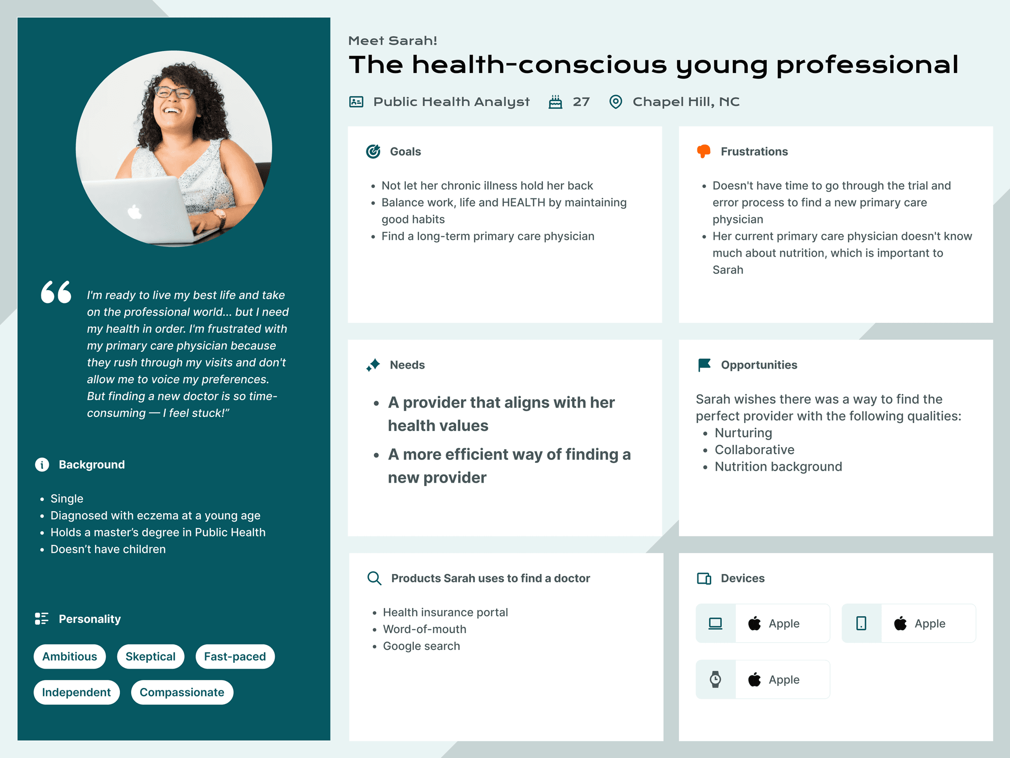
Meet the health-concsious young professional
Empathizing with the needs and frustrations of our research participants, I defined who would be using this product. The primary persona remained central in every design decision and allowed us to peek through the lens of our users. However, it was also important that the product accommodated the secondary persona.
Primary Persona
Secondary Persona
THE OPPORTUNITY
How might we enable individuals seeking a new primary care physician to find one that shares their health values during their initial search?
Ideation Phase
STORYBOARD
A picture worth a thousand words
Rapid brainstorming sessions, resulting in the proposed solution: Make finding a new primary care physician as stimulating, easy to use, and personalized as shopping online for a new outfit.
A storyboard was created to empathize with the health-conscious young professional seeking out a new primary care physician and better understand the proposed solution's impact.
TASK FLOWS
Outlining the user journey and paving the way for usability testing
With the storyboard hinting at the potential impact on our persona, I transformed the idea into task flows that illustrate the user journey.
Task flows were created and prioritized based on their effectiveness in helping the user quickly find a primary care provider that aligns with their unique health values.
The chosen task flow contained the following critical interactions:
Quick assessment that filters the provider search based on users’ unique preferences
Detailed provider profile
Easy appointment booking
DESIGN PATTERN RESEARCH
Gaining insights from successful design patterns
Before jumping into sketching, I conducted extensive research on design patterns relating to our task flow. Our investigation extended beyond healthcare, reaching into e-commerce, where I gleaned insights from experts who create engaging, user-friendly, and personalized products.
Care/of onboarding quiz
Opens with a welcome message
Copy is simple and user-centered
Minimal use of input fields increases the efficiency of the quiz
Carvana product page
Favorites allows user to return to saved cars
The sticky content switcher assists in navigating through the extensive product page
Ada AI Chatbot
AI Chatbot interface design mimics a familiar texting conversation
Copy is simple
No input fields — the user only needs to make selections provided by the chatbot
Design Phase
LOW TO MID-FIDELITY WIREFRAMES
Adding structure and function to the ideas
Working from low to mid-fidelity, I explored and assessed numerous designs for their effectiveness at streamlining the task of taking an assessment to find a doctor match and booking an appointment with the doctor of choice.
Below is a recap of the persona's needs and how I consciously addressed them through design:
Persona's needs
Design opportunities
A more efficient way of finding a new provider
Eliminate input fields to increase the efficiency of the assessment
Include a progress tracker to provide users with feedback
More upfront information about the doctor, so they don't have to choose one blindly
Add qualitative content to the doctor's profile, including photos, quotes, and a description of their approach to medicine
A provider with specific qualities and certifications that align with their needs and ailments
Use tags on doctor profiles to provide the user with a quick overview of essential information and allow them to sort
BRANDING
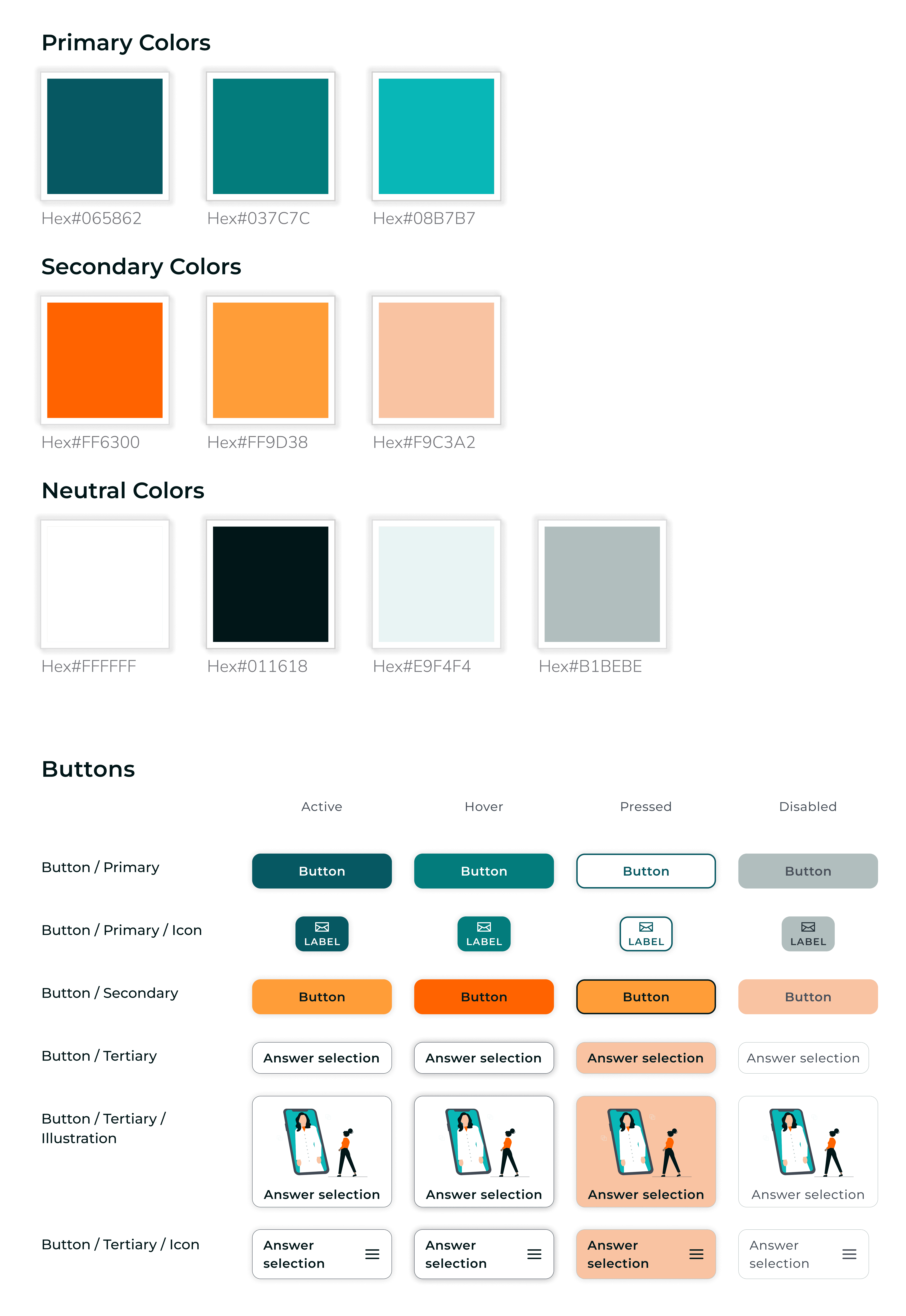
Balancing a cool, clinical aesthetic and a comforting, warm ambiance
Color Selection
Typeface
Logo
The complementary blues and oranges balance the clinical, sterile aesthetic often associated with doctors’ offices and the comforting, nurturing ambiance that our persona sought out.
HIGH-FIDELITY WIREFRAMES
Refining the interface for a better user experience
Developing the high-fidelity wireframes involved incorporating brand elements into mid-fidelity wireframes — made simple through the design thinking process.
Testing & Iteration Phase
I conducted moderated usability testing with 5 participants.
Task tested:
Take an assessment to find a primary care physician match, and schedule an appointment with a provider.
Validating results — at a glance
Task completion rate:
100%
Average time to complete the task:
7 minutes
Average number of errors:
3
Average rating on a scale of 1 to 5:
4.3
How do you feel about taking an assessment to find a doctor match?
"I find it very important because it gives me a sense of personalization… Its not just a generic one."
-Aboli
KEY ADJUSTMENTS
Additional assessment criteria needed
Health insurance
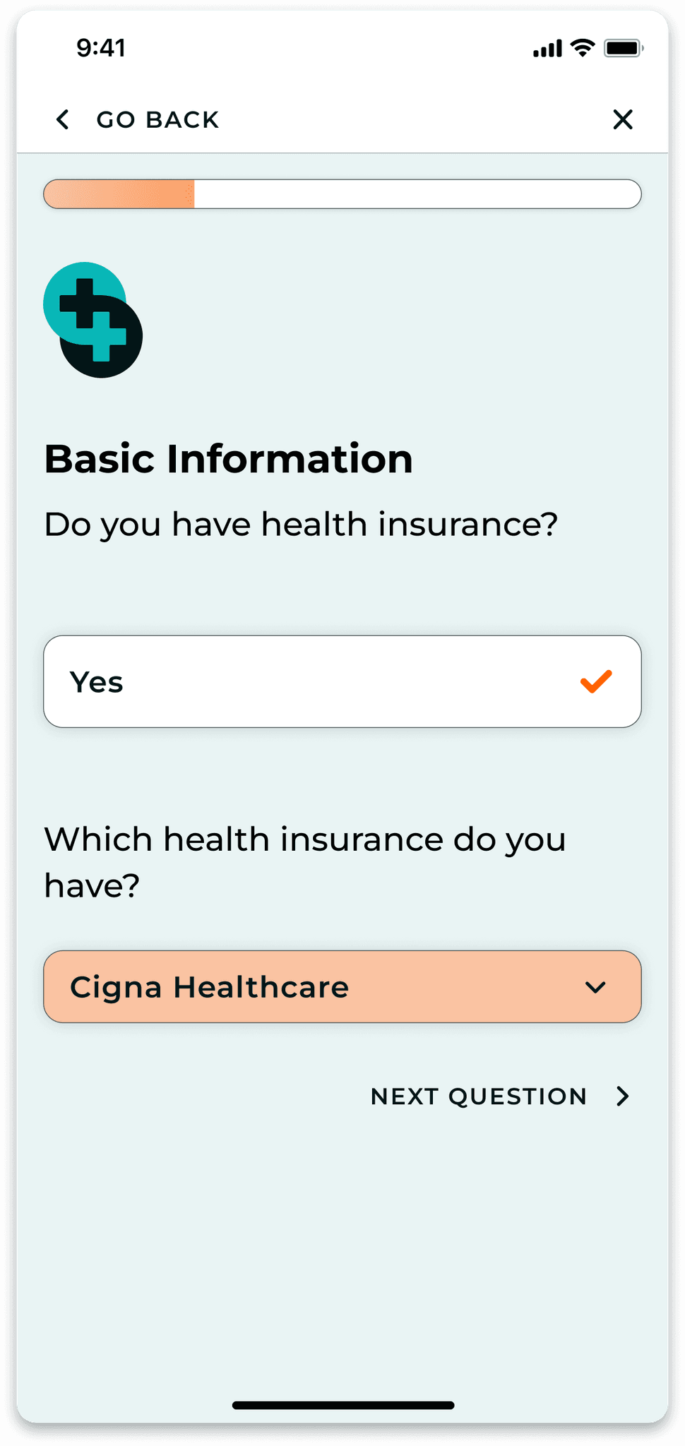
5/5 participants expressed the need for additional assessment criteria to narrow down a provider match further.
Three additional assessment questions were added to accommodate the participants' needs.
KEY ADJUSTMENTS
Going back to the assessment
5/5 participants experienced frustration when returning to the assessment from the provider match page.
A “go back to assessment” button was added on the top of the page.
KEY ADJUSTMENTS
Information and visual hierarchy on provider profile
I adjusted the information hierarchy by replacing the "credentials" section with the "approach" section.
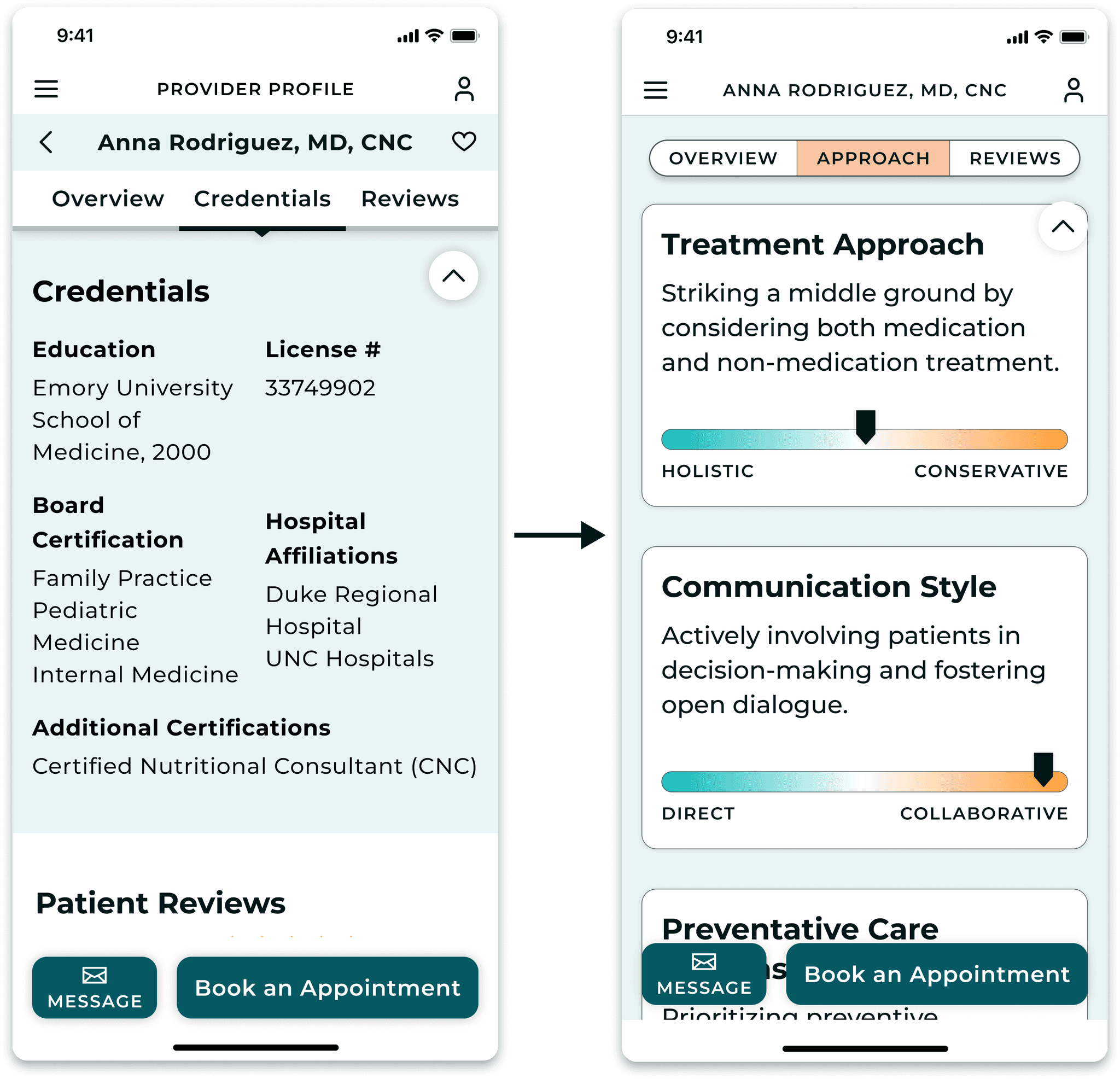
Various participant behaviors and feedback reflected frustrations with the provider profile:
Underutilized content switcher
Expressed disinterest in viewing the provider’s credentials
Expressed keen interest in the provider’s approach section
KEY ADJUSTMENTS
Language causing hesitation
The “balanced” answer choice was replaced with “integrative."
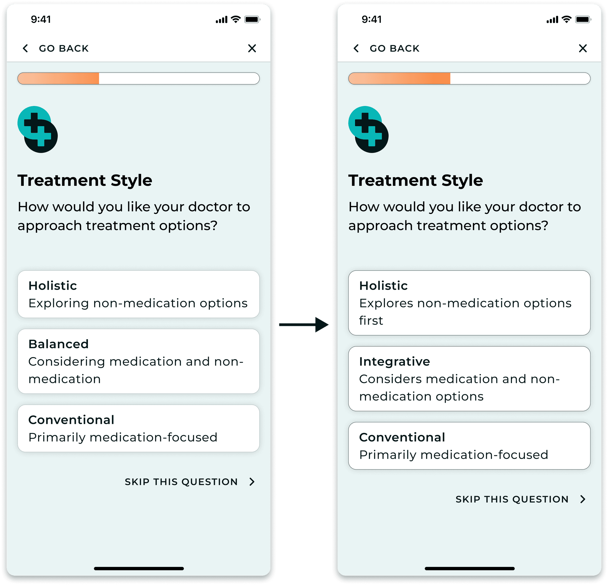
4/5 participants experienced confusion or hesitation when answering three questions.
I approached each question carefully to address the participants' frustrations.
Results & Next Steps
THE PROBLEM
Finding a new primary care physician is a lengthy process of trial and error
Due to limited information about providers' medical approaches on their online profiles, users often face the challenge of making blind choices, resulting in poor provider-patient matches. This forces users into a time-consuming and frustrating trial-and-error process to find a suitable match.
THE SOLUTION
A quick assessment matches users with a primary care physician that aligns with their health values
I created Think Patient, a mobile website designed to help users find a primary care provider that aligns with their health values on their first try. A quick assessment matches users with providers whose medical approaches align. Once the user selects a match, they can book directly through Think Patient.
NEXT STEPS
Narrow down assessment questions
Hesitation observed during usability testing highlighted the necessity for further surveys and testing to refine the assessment questions and accompanying copy.
Use tags in patient reviews to feed into assessment algorithm
It's crucial to input impartial information into the assessment algorithm, particularly when dealing with questions about the provider's medical approach. Review tags can be utilized as a data source to counter potential provider bias.
Develop user profile containing centralized health information, messaging and booking manager
Streamlining medical record transfer, direct doctor communication, and appointment management in one place is essential for speeding up the search for a new primary care physician. Due to time constraints, I couldn't develop these features, making them our next priority.
A/B test and monitor user activity for data-backed decision-making
A/B testing is necessary to make data-backed decisions for design variations, such as the content switcher on the provider profile page. Additionally, user activity in the platform must be analyzed by assessing heatmaps, conversion funnels, and surveys to guide the following steps and make the product more efficient.
Jump to


