Rachel Florence Wellness
A responsive website for a small health coach business spotlighting the coach's authentic qualities and enabling clients to easily schedule online consultations.
Role
Researcher,
Product Designer
Tools
Figma, Otter.ai, Zoom, ChatGPT, G-suite
Timeline
July - August 2023
Skills
User research, Synthesizing Research, Information Architecture, Customer Journey Mapping, Wireframing, Branding, Prototyping, User testing
Rachel Florence Wellness is a small health coach business serving women who are interested in living a healthier lifestyle
THE PROBLEM
Prospective clients hesitate to engage with a health coach until they have a glimpse of their genuine personality through their website
For those seeking a new health coach, the coach's personality is equally as important as their credentials. This is especially true considering the intimate nature of the health coach-client relationship, where the coach provides tailored support, motivation, and accountability to meet each client's unique needs and preferences. Therefore, it is crucial that the Rachel Florence Wellness website convincingly communicates Rachel's genuine personality as a health coach.
THE SOLUTION
Use interactive mixed content to portray the health coach's personality and the services offered
Introducing Rachel Florence Wellness, a responsive website designed for a small health coaching business. This platform authentically showcases Rachel's personality and makes it easier for them to schedule online consultations. Mixed content caters to a diverse audience and offers a holistic understanding of who Rachel is, motivating them to engage with her services.
Research Phase
BUSINESS CONSIDERATIONS
An adaptable business with a strong vision
Considering it was the early stage of the health coach business, my client Rachel was receptive to adjusting her approach in line with the insights gained from user research. Certain constraints were predefined, including the business offerings and target user group. However, there remained opportunities for innovation in areas like website structure, branding, content, and the overall business strategy. Weekly discussions with Rachel were instrumental in finding the right equilibrium between her business objectives and the user insights I unveiled.
COMPETITOR ANALYSIS
Heavy emphasis on branding at the expense of usability
I conducted a competitive analysis to understand how health coach business competitors promote their services online. Emphasis was placed on the available features, successes, and shortcomings, revealing opportunities for innovation.
Reputable health coach business websites had various usability concerns:
Limited accessibility due to font size, style, and color choices, along with hidden text that requires hovering to see
Complicated site structure with an excess of navigation tabs
Overabundance of text and jargon that leans toward system-oriented language.
Consistent branding
Social media integration
StretchLab became one of my references for a user-friendly website effectively showcasing the offerings and personality of the business:
Content switchers allow users to make the choice of exploring additional content
Effective visual hierarchy helps tell the story of the business
Highlights benefits of stretching to make connections for prospective clients
Heavy use of photos to convey the personality of the business
USER INTERVIEWS
“Someone can have great marketing, branding, and copy, so you think it all is great, but then you meet them, and its not quite the same..."
Through in-depth user interviews with women between the ages of 25 and 60 who have worked with a health coach, I gained comprehensive insight into participants’ first-hand experiences finding and working with a health coach.
Key Findings
"… if I were to be looking for a health coach, I would want someone that matched my energy…"
– Rachel R
INSIGHT: People want health coaches that compliment their personality.
"I was learning from her in between meetings... I read her [Instagram] posts and I’m like “ugh I needed that! I have my inspiration for the week!"
– Jackie
INSIGHT: Video and social media content help establish credibility, authenticity and inspiration.
"I would also like it if they can share their journey... using that to motivate their clients."
– Annie
INSIGHT: The health coaches' personal stories help establish trust and motivation.
PRIMARY PERSONA
Meet the future-centenarian
Empathizing with the needs and frustrations of our research participants, I defined who would be using this product. The primary persona remained central in every design decision and allowed me to peek through the lens of the users.
THE OPPORTUNITY
How might we provide potential clients with a deeper understanding of a health coach's authentic qualities beyond marketing and branding efforts, enabling them to make more informed decisions about the coach's suitability?
Ideation Phase
RAPID-BRAINSTORMING
A "Crazy 8" brainstorming session that I facilitated with a team of product designers introduced collaboration and time constraints that compelled us to switch between ideas, without hesitation or excessive contemplation swiftly.
This exercise resulted in the proposed solution:
Use interactive mixed content to vividly portray the health coach's personality and the services offered
15 minute introductory calls
Integrate videos/social media
Sign up for daily inspiration messages
User survey to learn about their preferences
SITE MAP
Defining the site structure and narrowing the design scope
The competitive analysis revealed inconsistent and confusing site structures among different health coach websites. To gain deeper insights into the user's mental models, I conducted a remote, unmoderated, hybrid card sort with six women aged 25 to 60, all of whom expressed an interest in engaging with a health coach.
26 out of 30 cards were sorted into common categories by four to six participants indicating similar mental models. However, feedback from participants revealed confusion around the "services" and "products" categories, suggesting a need for further differentiation.
Clarification from my client, Rachel, highlighted that the business plan exclusively involves offering health coaching services and not selling products, thus eliminating the need for separate navigation tabs.
Armed with insights from the card sorting exercise, I devised a site map, adjusted the copy, and reorganized the structure to better align with user mental models. This facilitated productive discussions between the client and me about which pages to prioritize in this phase of the design process. Given the time constraints, we narrowed our focus to the following pages: home, about, services overview, and booking a consultation.
Design Phase
LOW-FIDELITY WIREFRAMES
Adding structure and function to the ideas
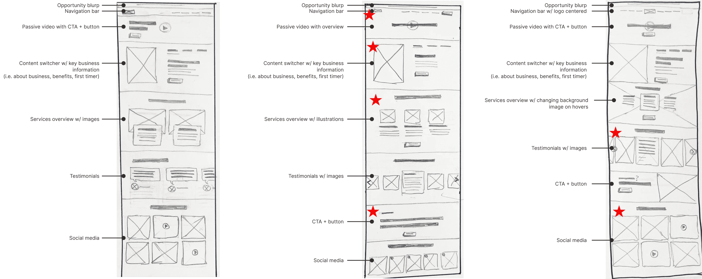
Through low-fidelity wireframe sketching, I delved into a multitude of designs to evaluate their efficacy in communicating the business's services and genuine personality, while also facilitating consultation bookings.
Collaborating with my client, Rachel, we jointly made decisions for each section of the website, and I subsequently synthesized these decisions into the following three final low-fidelity wireframes:
Home page
About page
Services page

Upon shifting to higher fidelity and adding content, it became clear that the services page had too much information folded into content switchers, which could quickly overwhelm the user and wouldn't be able to accommodate Rachel's content. To solve this we made the following adjustment:
Utilize the services page as a summary, and create distinct pages for 1:1 Coaching and Group Coaching, where you can provide in-depth details
BRANDING
Reflecting Rachel’s health coach personality: empowering, welcoming, supportive
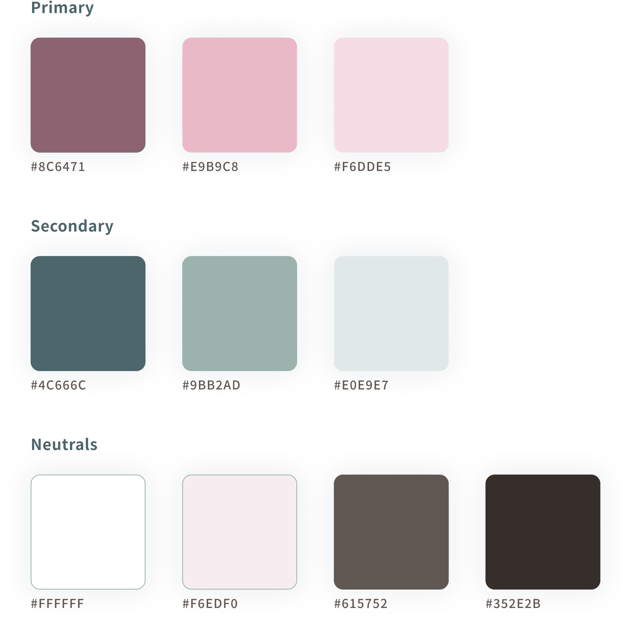
Color Selection
Typeface
Rachel expressed a preference for colors encompassing shades of pink, green, blue, and neutrals, which accurately mirror her gentle disposition. I presented her with a couple of color palettes, empowering her to make the ultimate selection and actively participate in the decision-making process.

HIGH-FIDELITY WIREFRAMES
Refining the interface for a better user experience
Crafting the high-fidelity wireframes entailed the integration of brand elements into the existing low-fidelity wireframes. This process involved not only translating the brand's visual identity but also ensuring its consistency and resonance throughout the design, aligning every visual component with the business's unique personality and goals.
KEY SCREEN
Home page with mixed content to convey the personality of Rachel, the health coach
Testing & Iteration Phase
I conducted moderated usability testing with 5 participants.
Tasks tested:
1) Learn about Rachel and the services being offered.
2) Book a free 30-minute discovery call.
Validating results — at a glance
Task completion rate:
100%
Average time to complete task 1:
2 min 24 sec
Average time to complete task 2:
1 min 23 sec
How would you describe the personality of the business?
"Personal, gentile, welcoming" - Sandra A
"Happy, uplifting, earthy, calming" - Brittany
"Energizing, rejuvenating, inviting" - Sara M
"Inviting, positive, welcoming" - Daniela G
"Holistic, female-led" - Hannah A
KEY ADJUSTMENTS
Improve affordance on content switchers
5 out of 5 users did not interact with the content switchers, and some even noted its similarity to a logo.
To enhance its usability and recognition, I replaced the swirl underline with a straightforward line and added color, mirroring conventional content switcher design patterns, making it more user-friendly and familiar.
KEY ADJUSTMENTS
Reorganize the hierarchy of the services page to highlight the comparison chart
All five participants showed enthusiasm for the comparison chart located at the bottom of the services page. However, it was observed that it required a considerable amount of scrolling for users to reach that section, and one participant almost entirely missed it. Furthermore, participants conveyed their frustration regarding the abundance of text on the page.
In response, I restructured and condensed the content on the page, introducing an "Explore the differences" button that allowed users to jump to the comparison chart. Furthermore, I merged the individual videos into a single comprehensive video that elaborates on both of the services.
KEY ADJUSTMENTS
Adjust the visual hierarchy of testimonial carousel arrows
Several participants missed the arrows enabling them to click through the testimonial carousel.
I changed the arrow's color to a deep blue hue and reduced the opacity of the testimonials on the left and right sides. This signals to users that there's additional content to explore in the carousel while enhancing the prominence of the central testimonial.
Results & Next Steps
THE PROBLEM
Prospective clients hesitate to engage with a health coach until they have a glimpse of their genuine personality through their website
For those seeking a new health coach, the coach's personality is equally as important as their credentials. This is especially true considering the intimate nature of the health coach-client relationship, where the coach provides tailored support, motivation, and accountability to meet each client's unique needs and preferences. Therefore, it is crucial that the Rachel Florence Wellness website convincingly communicates Rachel's genuine personality as a health coach.
THE SOLUTION
Use interactive mixed content to portray the health coach's personality and the services offered
Introducing Rachel Florence Wellness, a responsive website designed for a small health coaching business. This platform authentically showcases Rachel's personality and makes it easier for them to schedule online consultations. Mixed content caters to a diverse audience and offers a holistic understanding of who Rachel is, motivating them to engage with her services.
NEXT STEPS
Replace and enhance website content
Considering the early stage of the business, Rachel is in the process of developing website content. Once this content is ready, it will replace the temporary placeholders and infuse more of Rachel's personality into the website.
Develop the 1:1 Coaching page, Group Coaching page and Resources page
A/B test and monitor user activity for data-backed decision-making
A/B testing is necessary to make data-backed decisions for design variations, such as the content switchers. Additionally, user activity in the platform must be analyzed by assessing heatmaps, conversion funnels, and surveys in order to guide the next steps and make the product more efficient.
Jump to


